Art Work Created for My Double Page Spread

Screen Shot 2016-04-28 at 23.09.14.png

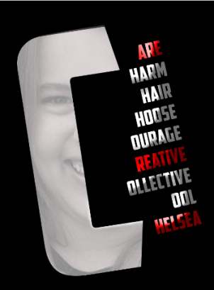
This is the start of my double page spread. I create the Type, Shadows and Strobe lights in Adobe Illustrator and Photoshop. Next I will add a small amount of text to the page as I don’t want to overload the audience with too much information. I will spread the content over a few pages just to make it more audience friendly. The colour schemes I will follow is the American theme: Red, Blue, White and Black. This is fitting for my chosen topic as it was about Americans.


Here is a picture of Richard Nixon he was president and was a huge part to the Watergate scandal. It resulted in him resigning in his role and became hated by many people. I wanted to make the picture more subdued and more isolated. By stripping it of all colour it makes the image more of that century and more journalistic of the time. This gives my double page spread more grounds to of reflecting that of the time. I also made the background transparent and played around with the levels of dark and light tones until I was happy.

Above are two different picture elements, I printed each one onto card paper the ripped the stripy paper, this gave the image a more dynamic view. I then placed it over the top of the blue star’s paper, leaving a section in the centre revealed.

It appeared like this once scanned in, I also placed it into Photoshop and used the Hue and saturation tool to manipulate the colour balance. I also gabbed a paint brush and turned the colour to white, The brush was a scattered style. This allowed me to make more texture on the page to make it reflect that of a flag. Once it was something like what I wanted, I then made shadows to make more depth within, my art pieces. I also used the burn tool to make the graphic darker and reflect that dark period in american history. it added more depth and tied into my topic.

I then applied this within my InDesign project and added things like headlines and subheadings.

Digital Versions of My Sketches

After coming up with some ideas, I then produced digital versions so see how well they came out. There where designs that didn’t look good at all when I produced hem and others looked more appropriate for the task.

The Bad attempts 

Screenshot (10).png

This one looked wrong and didn’t seem to be a brand that would be catchy or remember-able. As I didn’t like the digital version I ruled it out and decided to move on.

Screenshot (9).png

This next design was a complete failure as I tried to create an Additions logo. This used typography as well as a picture. This would not be a brand identity as it is too much and at different sizes will become unreadable and not good at all.

I ruled this one out and decided not to try and develop it further as it wasn’t going to become my brand.

OK Brand Ideas

Screenshot (8)Screenshot (12)

This logo was better then the ones above, however I didn’t feel it was creative enough. It is very basic and not that what people will remember. My design has to be more creative and so that I stand out amongst others. This logo was that what reflects that to what’s already out on the market. Journalist generally just have there names simply done. I want to push boundaries of what is the normal for people in the Journalism field. The second logo with the black, white and yellow is designed that way as these are my sporting colours. In both of these logos i have designed each letter used in Illustrator.

My favourite brand ideas 

Screenshot (11)

This design is my favourite by far. it really reflects me. The ‘C’ and the ‘M’ are made from wheelchair tires. This is key as i am disabled  and not ashamed to represent this aspect of my life. The wheels are symbolic as they showcase my personality. The chair transports me around but I am the individual. some people say they don’t want to be defined as a wheelchair user but I see it that its a part of me and why be ashamed.

This design is the building blocks which i want to work from. I want to make it flow better and to make the ‘M’ a continuous flow. The ‘M’ to me looks to much like the McDonalds ‘M’. This could get me into a legal issue if kept this was so by making it flow better and get ring of the central piece of the ‘M’ will help to make it less like the McDonalds brand. The brief states it must work in colour as well as black and whites. My chosen colour scheme will have dark reds or golds.

FINAL HEADLINE FOR INFOGRAPHIC USING ILLUSTRATOR AND PHOTOSHOP LIGHT WORK

Before, I began I familiarized myself with the processes using a smaller amount of letters. This process took me a while to get the grips of but the end product looked of a high standard. This to me was a technique that was transferable to other pieces of my work. This allows me to uses the skills to improve and develop my creative flare.

Final firstfinal practice.png

For my info graphic design I will be representing the Paralympics from London 2012 using key data along the way.  The word Paralympic is very under rated in accordance to that of the Olympics therefore I wanted to make it stand out and have a bold and eye catching impact for viewers to take notice.

First of all I started of in illustrator and developed the key shapes of each letter, along the way making sure that there were no over hang. To make sure that there was no over hang I clicked (CMD + Y).

para

I then added colours into each segment of the letters, I decide I wanted to use gradient and as I was transferring it to Photoshop I knew I could add colours in using overlay so at this moment kept it blacks and whites. This makes areas dark which will be unseen in the final product. Once this was done I then added texture stroke lines into the letters, this creates more depth to the product.

Screen Shot 2016-01-15 at 11.58.16

After putting it into photoshop, I then worked on the letters even more creating layers and new folders, this helped to keep it organised. The first folder created was the background layer, the background of choice was black this helped the dark areas to blend in, creating the contrast. I then created another folder for text light this is where I used the pen tool and selected points in the letters to create shapes. Once enough selections where made I then clicked the black pen tool and selected them so that they were all highlighted.

Screen Shot 2016-01-15 at 11.58.41

Once this section of the process was complete i then started on creating directional lines, from the first attempt i gained the knowledge on how to achieve the same style. this skill was transferred into my new project once all the directional light layers were in place the project looks like this.

Screen Shot 2016-01-15 at 11.58.57

the next stage of my process was to add curves, to the text the brought out and emphasised the curves within the shapes. This gave the graphic a different element.

Screen Shot 2016-01-15 at 11.59.11.png

other stages of the process included, adding colour layers and adding orbs. this made areas of the text stand out and shine. This is symbolic as it could have connotations to the athletes themselves as they all shined to get to the worlds competition and represent there country. This is a proud moment for all individuals that participated and would be the highlight of there life whether they win or not.

Screen Shot 2016-01-15 at 11.59.47.png

The end product in my opinion works really well and definitely stands out. There are things that i would like to have done better but for only my second time using this technique i am really impressed how well I’ve picked it up. This skill will help me to create other high professional products.

End product

Screen Shot 2016-01-12 at 20.44.27.jpg


Creation of Humber Street 4 page spread

In this session, we have been set the task to produce a 4 page spread – with the topic ‘Humber Street’. To help me create the print product that has been asked of me i have used open sourced software.

Original Template

The title I changed to something much more appropriate to the subject “Humber Street”. I also got rid of the images and backgrounds, so that I could make them much more appropriate to the task.  There were to many pages on the template so I deleted some of the pages to make it fit the requirements of task.

The pages with some changes made (Not with actual text – place holder text) I will be using research to help me make it factual – the placeholder text doesn’t represent how much text will be on the page just there as a plan for where i want to put text. I want the overall project to look clean and very visual (lots of images) not much text , This means it will give the audience a better experience.

Follow this link to go to my Humber Street magazine https://www.lucidpress.com/invitations/accept/7700c48d-be26-4477-830f-e004c1acfce1

This slideshow requires JavaScript.

Images used for project- Actuality and Secondary sourced 

KONICA MINOLTA DIGITAL CAMERA

This image was taken by me on KONICA MINOLTA DIGITAL CAMERA

This slideshow requires JavaScript.


After putting the images into a rough plan of the template, I then manipulated the size of each image to match what I had in mind for the layout. After doing this it was about adding text – Title and body copy. In order for my DPS to be factually accurate I now needed to conduct market, background and secondary research.

In the slide of the secondary sourced,  images that I have sourced from a number of websites including that of

The task is now to find the key relevant research.

First attempt on creating an Infographic for Topic

As I have chosen to develop and create an information graphic using data based around the topic of The London 2012 Paralympics. I had to practice different techniques and skills on editing softwares; in order for me to portray the data in a more appealing and visual manner.

First Attempt at using photoshop to create a visual image.

Before edit images

This slideshow requires JavaScript.

After

top 5 countries (hands)

This image helps me to represent the top 5 countries in the medal table. My thought process behind this edit and layer masking of images was to

  1. Showcase that talent and countries are open with welcome hands, that talent is something to be captured and talent can bring nations together as one.
  2. China is out side of the hands and centralised to showcase they where the superior country in terms of the medal table. Also to showcase the aspiring countries. Mainly the hierarchy / status.
  3. Also with this, it could mean different things to different people
  • that we have the world in our hands and the world is one and united
  • That we have the world in our hands (iconography of the song)

Other readings and connotations (the preferred reading the meanings that i want the audience to get from it. Alternative readings or oppositional readings)

I believe this particular attempt went really well in terms of the layering and masking. However, I think i am going to have other attempts using the same data but a different style of edit using other techniques, to see if there is a better way to present the data. I need to consider the audience and what they will like to see and what will grab the audiences attention.

Reflection on Green Screen

In the last session of creative futures in video, we were introduced to the importance of green screen and how to employ it for our own work. This process of how to use green screen was very simple for me as I have used this when creating projects/ videos for the last course I did. However, this lesson was a really good recap to refresh my memory. lighting is really crucial when using green screen, the subject has to be really when lit. when doing this task there are multiple ways of doing this.

  1. Use a green backdrop and make sure that the subject is well lite by lights and for the background to have light.

Or

2. The way we did it in the last session where we used a white screen and two lights that had green filters over the top this made the backdrop appear a green colour. In the room it was really dark which meant that there had to be other lights to make the subject well lit, making there face show up really well. For instance, Set up two lights, one from each side, and both a good distance from the screen. This will avoid getting a bright ‘hot’ spot in the center of the lit area. Ideally there should be one key light and two soft There could be more. After the lights were all set up there wasn’t any shadows and the subject was lit fairly evenly, this allowed us to capture the subject clearly.

Once all footage was collected, it was time to place it into Premiere Pro to change the background into something much more. This was a step by step process in which the group followed:

  • Drag the footage onto the timeline
  • Go to the effects panel
  • Drag the eight-point garbage matte onto the footage
  • Go into the effect controls
  • Move about the volumes, to move and cut the background
  • In the effects bar, search for ultra key and drag it onto the footage
  • In effect controls, change the key colour, use the picker tool and hover over the green background
  • Go to output, alpha channel, pull all the whites and blacks
  • Drop the matte generation in the effects control and change the value of the pedestal
  • To view the difference made change back the output back to composite
  • Go to matte cleanup changing the choke and soften settings, trying to get rid of the green
  • Go into spill suppression and change the desaturate, range and luma effects
  • Go onto the internet and find a large image and save it
  • Drag the image onto a new video layer
  • Drag the image to the layer making sure its behind/underneath footage and

Finally Make sure image is same length as video

This was the finished project after following the steps (me and Danielle worked as a team as i was slightly late to the session as my taxi was late)

Before

After

green screen

This technique and tool will be really useful when creating my own footage (like PTC’s) this will allow me the opportunities to add in footage in the background and add in any other things that maybe of importance.


Basic Typography on Adobe Illustrator

In todays session we were given the assignment brief for this part of the course. This highlight what the project and things we have to do to make sure that we pass. Making the work to a high standard.

After discussing the assignment brief ‘David’ moved the session onto typography, this is seen everywhere, it helps the audience to identify and familiarise themselves with specific language, branding and visuals. By having typography, it helps companies to sell products as it convinces the audience to buy into the brand visually and ascetically. Typography is much more complex and complicated in comparison to signs and symbols. Within this session we had a tutorial on the different ways to used simple typography in illustrator. These are some of the simple ways to add design to the ways text sits within a document and what can be done.type practice original text with strokeThis image showcases my knowledge on how to insert a simple text box and typing my name. also that I can change the colour of the text and add a different coloured stroke to the lettering. This is useful to know as I will have to use the text box tool a lot when designing things.

type practice, ungroup letters and mainuplate pointsI did the same things as the first image, however with this one, I then highlighted all the text right clicked and ungrouped. This meant that I could move each letter around individually. It also meant that I could play around with other tools, to change the appearance. This can look unprofessional so I would be careful to keep my designs simple but yet creative. my designs have to be audience appropriate.

type practice blending background into text

In the image above, it shows an image/ pattern through the lettering this was a very simple process. Basically, i got an image and created a text box and typed my name. i then placed the word above my image and highlighted both then right clicked and pressed make clipping mask

type practice 3D

This is a 3D perspective of my name, it still has a fill colour and a stroke colour. To do this i went to the 3D settings and manipulated the angle in which we see the letters from. This In my opinion can be useful but only for specific audiences and platforms. This would work as well on a more professional basis. Out of all the tutorial this was my favourite one to change as  it isn’t that complicated and there is so many options on how much or little i could change it too.

type practice adding text to a shapetype practice manipulating text into a shape from own designtype practice adding text to a normal box

This image highlights that I learned how to fill a basic shape with text this can be a very effective way to make boring text into that more digestible. This also might help to pull out important information in a design. By having this knowledge if need be I could use this technique within my own work. This can help to change the appearance of a lot of text. This also shows that i can create a shape and get text to mould to the desired shape. This is a useful thing to know as i can use this to my advantage if i wanted to text wrap around an image or another infographic.

Just from this session I realise the importance of typography and how it can help to sell a product, service or person. There are so many different ways to create attractive and high quality typographic’s. i actually feel like this could be fun to learn and develop my creative skills to produce my own work.

SOUND WITHIN A PROJECT

Sound is one of the key elements, if not the most important part in a video, without sound its just a moving image. A moving image will be harder to understand but with the sound it all makes sense. Sound helps to grip the attention of viewers, and helps to highlight the different tones. For instance, the ‘Jaws sound track’ has intertextual links to horror, provokes fear and helps to create tension. Without the sound it would have the same impact on the viewer and not give them that intense feeling they expect when watching.

Some ways of capturing sound could be through, on board microphones, lapel mics, clip on mics, boom arm etc. When creating projects before I have noticed multiple issues with sound and the sound quality

  • Sound can be muffled by wind, this sound awful and makes the overall product sound amateur.
  • Music can over power, the voices making them hard to hear. This can be amended but you lose the quality. On Premier Pro if you right click on the sound bar, audio gain and lift it up.
  • When editing it is crucial to splice the sound and video at the right point because it is no good cutting off the end words.

Sounds can help to portray a meaning, if this isn’t right then the whole project, video will not be to that high professional standard. As a practitioner, I will try and make sure that the sound is a good quality and making sure that when editing I pull out the key sound bites and edit it correctly. I can adjust settings of sounds it need be by using the audio gain if need be and add key frames if need too.

When making my 3 minute video and other projects I will definitely play a massive part to how the overall product will be. I want my product to reflect that of a near professional standard.

ETHICAL DEBATES SURROUNDING DESIGN AND ADVERTISING

Advertising is an incredibly important platform in which helps to provide viewers and potential customers with a visual aid about a product or brand. It is also a technique used as it can be aimed at all different age demographics. This helps to make a product feel more personal giving it more sell appeal. Advertising in my opinion can be a great thing for companies and traders as it can help them to gain all different kinds of things. For instance, it can helps increasing sales, helps to learn about other competitors, of the same path style. “Advertising helps making people aware of the new product so that the consumers come and try the product. Advertising helps creating goodwill for the company and gains customer loyalty after reaching a mature age.”[1]

There are also many downsides to advertising and designs as it is a lot more judgmental and critical currently in todays society. It can undermine the human qualities that are seen in the real world. For instance, not all people are slim built. Also modern society has the ability to manipulate and change things, like looks, face shapes, colours and the tones for an advertising campaign. In software’s such as Photoshop, illustrator, Premier pro, Sony Vegas etc. The software’s used to help manipulate a scene, person and much more can be immoral in my opinion as they change the ways things appear and look, taking away human qualities and truth. For instance, in a lot of fragrance or skin care advertisement’s they use hyper real humans, this means they change features to make them look better. In my opinion, it shouldn’t play as much importance as it misleads viewers. Truth in a provider is very essential as they should be giving you the correct facts and not just making something appear amazing. When developing my own designs and advertising I always try to not mislead people to much as I want to gain their interest and trust properly.

Another negative thing advertising does it put really small writing somewhere within the framing and if they don’t have the best quantitative information from a trial, they will simply just make the font colour a similar shade to the background so that the viewers are more unlikely to read the negatives. This in my opinion is morally wrong as it doesn’t make it clear to the viewer that it has negative reviews, it misleads people and can give them high hopes of a product and will be left feeling underwhelmed by the actual product. I personally find this frustrating as you believe that the traders would be honest and upfront, but to them its about the sales.

From looking at multiple advertisement’s and designs I do believe that they use things that have an emotional impact on the viewers, like who they want to be, what they want to look like, inspirational people ie celebrity endorsements. I personally think that advertising should have more reality and not try and manipulate people. This can make people feel like misfits as what they see it amazingly beautiful, slim and desirable. I think they should try and avoid making people feel this way.

[1] http://www.managementstudyguide.com/objectives-importance-of-advertising.htm

Introduction to Adobe Illustrator

As missed a few sessions for Creative Features – design, I had to catch up. I caught up with the tutor he said to have a go at using illustrator. Straight away when opening the software, I noticed that the layout and navigation appears to be the same as ‘Adobe Photoshop’. This was a good thing for me as I have used Photoshop many times so understand the software to some degree. All the tools and pallets were in the exact place within the software. I did wonder why there was two software’s nearly identical to each other, however from speaking to the tutor, I gained more of an insight into the difference between Photoshop and Illustrator. Illustrator uses a vector system in which is a more mathematical way in using plots in different places (co-ordinates) to map out the image. Like a formula because of this it means that the image can be enlarged and swapped about without the image losing resolution. This is important, as it will not look pixelated and not to that high professional standard. This system and software is measured in (PPI) which means pixels per inch. Photoshop is different in the sense that it is a raster-based programme, this means it is measured in dots per inch (DPI). This means that it works on colour and in some circumstances it will be pixelated if needed to resize.

By having ago at using the software, I learned how to set up documents based on the specifications required for each individual project. For print, I noticed that there is a bleed area, this is space out side of the document, when printing it makes the edges smoother when cuts are made and gives it a more professional quality. The same thing is used in other software’s like InDesign. When I have used InDesign in the passed I set the bleed lines to around 5mm, I presume this would be similar on Illustrator.  From talking to the tutor I gained valuable information, that illustrator was first created to allow people to trace things. Also that it is similar to Photoshop in the sense that layers of detail can build up an overall project file that you can be happy with. As I have had more time on Photoshop, I find that it is easier to navigate my way around but with time and practice I believe I could be quite good on the software.  To show my understanding, of the software I recreated the logo that was used in my TV studio project for Estuary TV. This was originally designed by the people who was on the productions team.  This ‘Positive Outlook’ brand was designed for the programme and concept I came up with, to pitch to Estuary TV. The original brand logo was not as good as this one. This was the one I put forward.

Screen Shot 2015-10-26 at 20.26.11

Some of the key tools that I used was the ‘Black pointer’ tool this allowed me to scale, move and turn things around to the rotation that was best suited. This tool is very similar to that on InDesign, along with the white pointer tool which is used more to change paths, points and the angle that things run. There were other tools that I found I recognized which was the pen tool and flares. The pen tool can be useful when creating outlines and shapes. This tool is a bit more complicated and takes some time to get to grips with.

As a practitioner of media and journalism, it is incredibly important to have skills to allow me to create graphics, brands and logos. Not only for myself but for client’s. This software will allow me to do this to a high professional quality.