Today, in a group chat with the people who turned up, it was identified that we still needed a logo for the name and byline of the website. I volunteered to do some designs for this because I enjoy the creative side of the course. Also with me having time off recently for ill health and my surgery, I wanted to show that I am back and ready to step up and work as a part of the team.
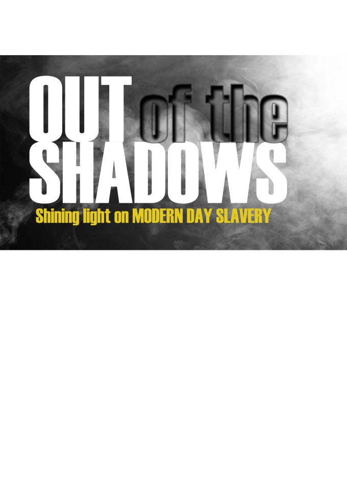
The agreed name of the website is: “Out of the Shadows” and the byline is: “Shining light on Modern Day Slavery.”
When creating this logo I know that it has to reflect that of a professional standard and has to also reflect the brand identity of the site. This will help to draw people to stay on the site and deem it as a highly well designed and thought out. Professionalism is key as it then makes the audience see content as reliable.
Whilst I know the text that has to be included in the logo, I am not entirely convinced on how the layout should look. To help me narrow down on a few different designs I roughly sketched on a piece of paper some ideas.

Once I was satisfied with three designs I then started to build digital versions. This will help me to see what works and what doesn’t. Also, it gives the group more designs to choose from. To build the digital versions I will and am still going to use Adobe Photoshop as this is a great tool and I have previous knowledge of the software.
For the first design, I wanted to create a spotlight effect. In order for me to do this, I referred back to old notes and spoke to Dave Eccles who taught me in the first year. He explained the steps that I needed to do and this really helped to refresh my memory. As he spoke I made notes in order for me to remember everything so I didn’t make a mistake.
Here is how you create a spotlight effect
Step 1: set up a blank document with a black background. set the canvas to 10 by 6 and 75 dpi. This can alter depending on the size of the file required.
Step 2: create a new blank layer, with that layer selected then click on the rectangular marquee tool. With this draw, a narrow selection in the middle of the canvas but all the was down to the bottom of the canvas. After this either click Shift and Delete (mac) or Shift and backspace if you’re using a windows system. this brings up the fill palette, set this to 50% grey and click ok.
Step 3: Go to the filters drop down menu and hover over render then select fibres. The fibres tab will appear. zoom the rectangle image out to 33 % so you can see the fill image set the variance to 4 and the strength to 30 then click ok.
Step 4: Next open the levels tab and the 3 points change to 16- 1.00- 138 then click okay. This will help with the contrast.
Step 5: After that go to the filter menu go down to blur then click on motion blur set this to 90 degrees up and down and set the distance at 250 pixels. click ok then add a layer mask onto the layer. use the gradient tool and in the pallet pick the 2nd item in the first row. This is the foreground to transparency. Set the colour to black. Press Shift and drag from the top of the rectangle downwards. Now you can delete the layer mask and click apply because that will keep what you have done on the actual layer itself.
Step 6: Press command, control and t and rotate the object to a make it angled off the corner of the page. whilst still highlighted click control and right click then pick the option to distort. push and pull the points to make it closer together at the edge of the page and open up the other points to represent that of a light beam.
Step 7: click control and the hue and saturation option the tab will open up. tick the box that says colourise and slide the points across until you get the colour that you want.
Step 8: create a round element by selecting the elliptical marquee tool and create a narrow oval shape. This shows the bounce of the beam on the floor.
Here are my efforts


The next design was more simple to create but still had a few steps, this time I wanted to use thicker text and smoke.
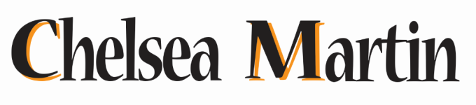
For the font of the text, I used Haettenschweiler. I thought it was bold and it makes a statement and was easy to read for the audience. Next, I wanted to use smoke but that is something I wasn’t sure how to create so i used an image from Creative Commons which is a royalty free site. This protects me and the project from legal issues with plagarism and copyrights.
The image was set as the background and I duplicated this layer and placed it higher the text layers as I wanted the image through the white text. To do this you go to layer create clipping mask. This has been successful on two words but having issues with the two other words I want the same. I don’t know what the issue is so I will ask Dave when i next see him around HSAD.
Here is my attempt so far
 I used the key information and colour schemes. I used my own picture of the Humber Bridge as it is an iconic landmark and the Hull City Lion logo. However, when I showed peers it they said that it may come across as promoting the football team and not really identify with the website.