I was asked to produce designs for the banner and logo for the new Hull Central website. I was briefed on the mandatory elements, and what they wanted. To prefer, the client was open to any design ideas.
It had to include:
- Quote – “News and Views for the centre of Hull”
- Colours – Blacks, whites and Oranges
- Has to be letterbox format
I planned out a few ideas in sketch format and then transferred the ideas onto Adobe Photoshop. Here is where I put together the designs and edited it all.
The first design
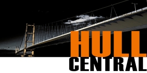
 I used the key information and colour schemes. I used my own picture of the Humber Bridge as it is an iconic landmark and the Hull City Lion logo. However, when I showed peers it they said that it may come across as promoting the football team and not really identify with the website.
They said that there was too much orange and that they thought it would look better without the tiger logo. Also, it wasn’t in the letter box format like originally asked for, this needs to be amended
The square logo here with some adjustments will be used for the social media logo but not for the banner on the website.
Below you will see the revised version, I removed the tiger logo, moved the quote higher up as there was too much text at the bottom of the logo. Changed the word Hull too white instead of orange and changed the image to white with a black background. I airbrushed a bit of orange on too the bridge as it helped to break up the black and white. Also kept with what the client wanted.
![]()
Banner Designs
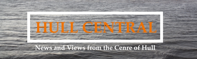
For the Banner I wanted to produce a simple, clear and professional looking design. As Hull has a long tradition and connection to the sea I thought that the main image to be used could be of the waters. I did two of the same designs one with a tiny bit of orange and one with just plan white text.

These designs where ruled out, because the audience didn’t feel a connection to Hull. The feedback showed that they preferred the logo design which was going to be used for social media instead.
Personally, I liked this design better as its simple and professional looking. Simple designs are better.
Anyways, when working with clients you have to put your personal opinions to one-side and provide them with what they want.

The client was happy with how it turned out in the end, I forwarded him all the logos and give him options to have it with or without the quote.
Final Logos Agreed
![]()