Developing the Brand Identity Further

If I was to continue to develop my Brand identity further, I would;

  • Make the CM flow better, by getting rid of the centre part of the M graphic
  • Make the M Graphic Just black instead of having the same graphic as a tire.
  • Consider different fonts and look at more colours

I think for my first attempt the brand is of a high quality but with these changes it will make it more simple and visually more professional.

Reflection on Emily Bell

Emily Bell is a significant influence in the journalism industry, she currently works at the Columbia Journalism School in New York City as the Director of the Tow Centre. She has had a very interesting and successful career over the years. Working for some of the most recognised media organisations around the world. From the Observer to the Guardian. Her career at the Guardian extremely successful and she spent two decades, writing and coming up with new platforms to what news could be used on. In 2000, she pioneered the mediaguardian.co.uk and became editor-in-chief of Guardian Unlimited a year later. She developed multiple of different ways to reach audiences on a digital platform.

Open Journalism has evolved over the years and is becoming incredibly important. Emily Bell has done so much towards the developments, for instance:

  • Creation of a two-way relationship between readers and the media – This allows audiences to leave comments, get involved and be a part of the news (building rapport). This is as important in today’s society as the world is online driven. People spend so much time on their phones, laptops and many other pieces of technology. By having a two-way relationship help to give the audience a voice and give them an immersive experience.
  • Online storytelling techniques – websites, social media, blogs etc. navigation, colours, content all play an important part in the success of a storytelling website.

Sound – Timeline and Timings

Show Outline

Here’s is my idea for my show timings

– Show intro monologue (who you are, what you’re going to talk about): 20 seconds

– Intro music jingle (if I was to make a sequence of shows I would repeat for each show so listeners identify the jingle with your show): 15 seconds

I want to create a pastiche jingle – this is a tune that sounds like another but is a way to get around copyright issue. I really need to find an upbeat, sporty and catchy tune which I could adapt. My first thoughts was to use Birdy wings. It’s catchy and inspiring to say the least.

– Topic 1 – Interview: 3.15

– Topic 2: Interlude (music or break): 10 seconds

– Topic 3:  Interview: 3.15

– Closing remarks (thank audience, thank guests, and talk about the next show): 20 seconds

– Closing music jingle (suggest same as Intro music jingle): 20 seconds


This structure is a rough outline to what my pod-cast will actually be.  It follows mandatory elements that we have to have in our piece and the timing or it runs approximately 8 mins long

Practice on Technique using small amounts of letters

Before starting my infographic I wanted to learn a technique that I had recently seen, it uses illustrator and photoshop with light work. I wanted to use this skill once I have had a practice as it is a transferable skill that looks impressive.

Screen Shot 2016-01-12 at 21.27.26

In Illustrator, i created letters using shapes. Once the letters where created and all looked fairly uniform, I then inserted the gradient colours and set it to black and white. The dark areas will blend into the background once in Photoshop.

Screen Shot 2016-01-12 at 21.40.15

When in Photoshop I created two different folders and inserted layers in each one. I renamed the folders one called background and the other text light. I set the background to black on a layer and moved on the text light layer, and started to use the pen tool to start picking points with in each letters.

Screen Shot 2016-01-14 at 20.04.07.png

Here I was using the path finder tool then clicked the centre point and clicked Alt and it deleted the anchor point then I could move on to the next point. This part of the process I struggled with as I was unsure how to delete the anchor points.

Screen Shot 2016-01-14 at 20.07.29

After, the is stage i then moved onto adding in directional light

Screen Shot 2016-01-14 at 20.09.30

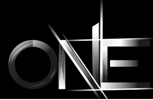
In the image above, I used the select tool and made a rectangle shape filled it with white. Place them around my text. i placed a filter over the top of the rectangle shape called gaussian blur.

In the images above show the type with colours added in this makes it look shiny and adds much more depth. i added different yellows and oranges and used the burn tool to darker areas.Screen Shot 2016-01-14 at 20.57.21

Sports Iconography (Paralympics)

When developing my information graphic I needed to understand the key components that are associated with Paralympics. For instance,

  • Medals
  • Flags/Countries
  • Amputees/ Bionics
  • Podiums
  • Juxtaposed outcomes (winner/losers),(darkness, brightness)
  • Fans (viewership/ support)
  • Community
  • Diversity and Equality
  • Opportunities
  • Equipment

these are just some of the key points I can think of, i will develop multiple information graphics to see which ones work and which ones not so much. The best one I will submitted. When coming up with the ideas i will try to showcase the key ingredients that makes up what we view as the Paralympic symbols and symbolic tones.