Potential Newsworthy Stories

Before deciding on the topic I am going to do for this task. I brainstormed a few potential stories and who I may want to interview for each one.

Hull City of Culture 2017 

There is a lot of things happening on the build up to the city of culture 2017. This could be an idea as it is informative and very newsworthy for local broadcasts. If I was to do this then I would contact the council to do a sit down interview on what is currently happening and what the expectations are in the next few months. Also Vox pops make the story more humanised as it shows the emotion running through local’s minds. Footage could be of the renovations of the city, blue prints and expected outcomes. Work men on work sites around the city developing what will be a modernised and better design.

Independent shops and business struggles

This was an idea as the independent coffee shop in the town centre has closed down due to lack of business and competition from other big named branded shops. Only a few months after the coffee shop did an interview speaking about the success of the business, it goes complete out of business and shuts down. Interview would be with the owner of the independent cafe and competitors in the market. Vox pops would add public’s views on what their preferences are – whether there more inclined to use branded shop in comparison to independent stores. Why they have this opinion and what they would like to see more of in terms of shops/businesses.

New boxing club opening up

This will be a VT package on a boxing club that has just opened and what they hope to achieve. Interview will be of the coaches speaking about what the club brings to the community and why boxing. Footage will be of the kids training inside and outside of the ring. General views, close ups will be seen within the video. I believe this one will make the best edit as there is so much that I could do with it.

By having options I can make a decision based on everything, I will look at accessibility, impacts, target audiences, what people in the city want to know and which I think I could do the best job at.
Reflection on 3 types of Visual Identity

Branding is so important to get right, there has to be a thought process behind the chosen design as it is a reflection of yourself. Everyone will make a judgment about you on how you present yourself. So your individual house styles need to be incorporated into the brand.

Many designs are different and may consist of one or more components. These can be things such as images, colours, slogans, words – typography, shapes etc. individual typefaces are so crucial in how you make yourself appear. Some people go for the professional feel and some that are more creative and break the mould.

Having a visual identity can be as vital within your life as humans work best with visuals once they get to know a brand, it creates a brand loyalty and a sense of respect.

There are three main factors when considering a brand identity

  1. Logo (pictures/shapes)
  2. Typography (text/numbers)
  3. Addition (logo and typography together)

When thing about my own branding I want to create something that is fairly simple but not to formal. This is because I really feel less can speak volumes and appear of the higher quality. Formal isn’t me, I’m a student and still finding my feet within the industry. This is something I want people to know as I’m not perfect but is willing to put my all into anything I do. I really enjoy type so think my end brand will have this as the main feature. I am still coming up with concepts so this may change.

Once I have a set design for my brand I would really like to create a series of different styles, different colour schemes and typefaces in general. This is something I want to investigate as I seen how well major companies have adapted there brands. Great examples of brands that have done this are: apple and coca cola.

FINAL HEADLINE FOR INFOGRAPHIC USING ILLUSTRATOR AND PHOTOSHOP LIGHT WORK

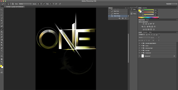
Before, I began I familiarized myself with the processes using a smaller amount of letters. This process took me a while to get the grips of but the end product looked of a high standard. This to me was a technique that was transferable to other pieces of my work. This allows me to uses the skills to improve and develop my creative flare.

Final firstfinal practice.png

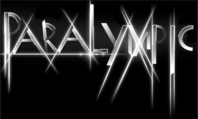
For my info graphic design I will be representing the Paralympics from London 2012 using key data along the way.  The word Paralympic is very under rated in accordance to that of the Olympics therefore I wanted to make it stand out and have a bold and eye catching impact for viewers to take notice.

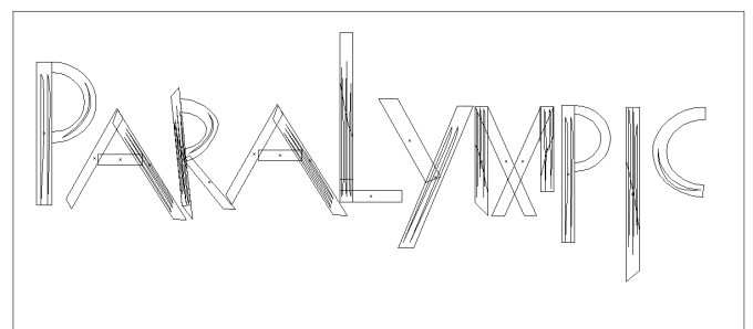
First of all I started of in illustrator and developed the key shapes of each letter, along the way making sure that there were no over hang. To make sure that there was no over hang I clicked (CMD + Y).

para

I then added colours into each segment of the letters, I decide I wanted to use gradient and as I was transferring it to Photoshop I knew I could add colours in using overlay so at this moment kept it blacks and whites. This makes areas dark which will be unseen in the final product. Once this was done I then added texture stroke lines into the letters, this creates more depth to the product.

Screen Shot 2016-01-15 at 11.58.16

After putting it into photoshop, I then worked on the letters even more creating layers and new folders, this helped to keep it organised. The first folder created was the background layer, the background of choice was black this helped the dark areas to blend in, creating the contrast. I then created another folder for text light this is where I used the pen tool and selected points in the letters to create shapes. Once enough selections where made I then clicked the black pen tool and selected them so that they were all highlighted.

Screen Shot 2016-01-15 at 11.58.41

Once this section of the process was complete i then started on creating directional lines, from the first attempt i gained the knowledge on how to achieve the same style. this skill was transferred into my new project once all the directional light layers were in place the project looks like this.

Screen Shot 2016-01-15 at 11.58.57

the next stage of my process was to add curves, to the text the brought out and emphasised the curves within the shapes. This gave the graphic a different element.

Screen Shot 2016-01-15 at 11.59.11.png

other stages of the process included, adding colour layers and adding orbs. this made areas of the text stand out and shine. This is symbolic as it could have connotations to the athletes themselves as they all shined to get to the worlds competition and represent there country. This is a proud moment for all individuals that participated and would be the highlight of there life whether they win or not.

Screen Shot 2016-01-15 at 11.59.47.png

The end product in my opinion works really well and definitely stands out. There are things that i would like to have done better but for only my second time using this technique i am really impressed how well I’ve picked it up. This skill will help me to create other high professional products.

End product

Screen Shot 2016-01-12 at 20.44.27.jpg