Reflection – Voice Training

In today’s session we had help to understand how to bring in emphasis on key words when broadcasting. Also how to bring light and shade into the voice tones. This will help me to sound much more natural and not as if I am reading from a script or auto cue. Also to get away from it all been monotone.

Today I leaned that women often have to lower their voice to a much deeper tone as they can be squeaky. This can be a distraction to listeners. Talking from the lower part of the diaphragm gives the reader more breathing time and makes the sound much more control. Guiding the voice is key to success. It depends what the piece is about but you can add depth within the tones, helping to create a mood and spark emotions. It is our job as broadcasters to understand how we can change and adopt our voice for different types of stories.

We did a practice run, with a script we had prepared earlier. We had to read it first then re-read it but put emphasis on the key elements within the news story. It was a good environment to get constructive feedback. This will allow me to understand what I can do to make myself a better broadcaster. My feedback was that I sometimes over emphasised and my script writing could have been improved more for speech.

We had to think about the techniques shown to us the week before about taking three deep breaths before going live. This brings down the pitch of the voice, this makes it sound much more professional and also improves the delivery of the content. Cat explained that if there’s ever a figure or statistic it must be emphasised, slow down when speaking and pauses can help to make sure that the audience can understand, hear and taking the key facts.

To me as a journalist it is an incredibly important skill to have and something that is a transferrable skill to different career choices. Voice training is key for me as I want to go into the broadcasting industry, so I need to know what I can do to make myself much more professional.
FINAL HEADLINE FOR INFOGRAPHIC USING ILLUSTRATOR AND PHOTOSHOP LIGHT WORK

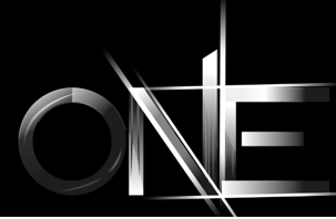
Before, I began I familiarized myself with the processes using a smaller amount of letters. This process took me a while to get the grips of but the end product looked of a high standard. This to me was a technique that was transferable to other pieces of my work. This allows me to uses the skills to improve and develop my creative flare.

Final firstfinal practice.png

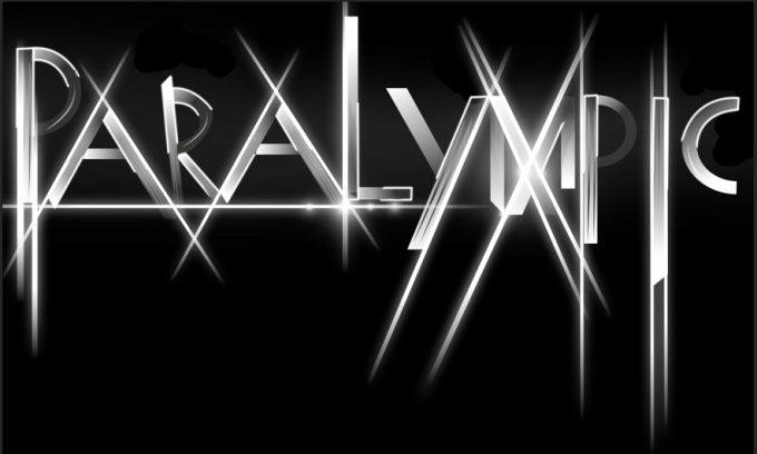
For my info graphic design I will be representing the Paralympics from London 2012 using key data along the way.  The word Paralympic is very under rated in accordance to that of the Olympics therefore I wanted to make it stand out and have a bold and eye catching impact for viewers to take notice.

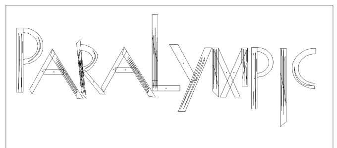
First of all I started of in illustrator and developed the key shapes of each letter, along the way making sure that there were no over hang. To make sure that there was no over hang I clicked (CMD + Y).

para

I then added colours into each segment of the letters, I decide I wanted to use gradient and as I was transferring it to Photoshop I knew I could add colours in using overlay so at this moment kept it blacks and whites. This makes areas dark which will be unseen in the final product. Once this was done I then added texture stroke lines into the letters, this creates more depth to the product.

Screen Shot 2016-01-15 at 11.58.16

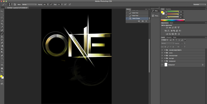
After putting it into photoshop, I then worked on the letters even more creating layers and new folders, this helped to keep it organised. The first folder created was the background layer, the background of choice was black this helped the dark areas to blend in, creating the contrast. I then created another folder for text light this is where I used the pen tool and selected points in the letters to create shapes. Once enough selections where made I then clicked the black pen tool and selected them so that they were all highlighted.

Screen Shot 2016-01-15 at 11.58.41

Once this section of the process was complete i then started on creating directional lines, from the first attempt i gained the knowledge on how to achieve the same style. this skill was transferred into my new project once all the directional light layers were in place the project looks like this.

Screen Shot 2016-01-15 at 11.58.57

the next stage of my process was to add curves, to the text the brought out and emphasised the curves within the shapes. This gave the graphic a different element.

Screen Shot 2016-01-15 at 11.59.11.png

other stages of the process included, adding colour layers and adding orbs. this made areas of the text stand out and shine. This is symbolic as it could have connotations to the athletes themselves as they all shined to get to the worlds competition and represent there country. This is a proud moment for all individuals that participated and would be the highlight of there life whether they win or not.

Screen Shot 2016-01-15 at 11.59.47.png

The end product in my opinion works really well and definitely stands out. There are things that i would like to have done better but for only my second time using this technique i am really impressed how well I’ve picked it up. This skill will help me to create other high professional products.

End product

Screen Shot 2016-01-12 at 20.44.27.jpg


Practice on Technique using small amounts of letters

Before starting my infographic I wanted to learn a technique that I had recently seen, it uses illustrator and photoshop with light work. I wanted to use this skill once I have had a practice as it is a transferable skill that looks impressive.

Screen Shot 2016-01-12 at 21.27.26

In Illustrator, i created letters using shapes. Once the letters where created and all looked fairly uniform, I then inserted the gradient colours and set it to black and white. The dark areas will blend into the background once in Photoshop.

Screen Shot 2016-01-12 at 21.40.15

When in Photoshop I created two different folders and inserted layers in each one. I renamed the folders one called background and the other text light. I set the background to black on a layer and moved on the text light layer, and started to use the pen tool to start picking points with in each letters.

Screen Shot 2016-01-14 at 20.04.07.png

Here I was using the path finder tool then clicked the centre point and clicked Alt and it deleted the anchor point then I could move on to the next point. This part of the process I struggled with as I was unsure how to delete the anchor points.

Screen Shot 2016-01-14 at 20.07.29

After, the is stage i then moved onto adding in directional light

Screen Shot 2016-01-14 at 20.09.30

In the image above, I used the select tool and made a rectangle shape filled it with white. Place them around my text. i placed a filter over the top of the rectangle shape called gaussian blur.

In the images above show the type with colours added in this makes it look shiny and adds much more depth. i added different yellows and oranges and used the burn tool to darker areas.Screen Shot 2016-01-14 at 20.57.21