Reflection -Aperture and Angle of View

In today’s session, as a group we discussed the importance of aperture and how the angles in which we take an image can change the whole tone, distance and professionalism of the image. Aperture is a massive part of the exposure calculation, when taking my own images I will have to consider this as it will have a great impact on whether the image is of a high professional quality. With the aperture restricting the amount of light entering the lens and image can become over exposed or under exposed. For my images, I have to make sure I have the right light balance as it changes the appearance of an image. Today, I learnt that the F.stop number refers to thickness of the black shutters within the camera which is there to blocking out certain amounts of light. As the aperture gets smaller there will be more depth, When the hole if restricted the light gets more focused. This means that as a practitioner I can decide what I want in focus and get rid of distractions if you want.

in these images i change the F.stop to create and develop different scenarios. in the first image on the left the camera focuses more on the right hand side hedge. The rest of the image seems much more in the distance and became blurry. The camera settings was set up on F3.2 and the image on the right is all in focus which doesn’t draw the eye into a specify point in the image, this looks much more basic and not as interesting. this image was taken at F8.

Angle of View, Occurs when using different lenses or the zoom feature. From participating in the practical I noticed when I used a wide angle lens with an aperture of f.stop 5.6, the subject can become distorted and will make things look further away than they are. The internal parts of the lens change the angle of the light being captured. The angle of the light when taking my own images is important as I can manipulate the surrounding area and make things appear further away or closer the the lens. to show my understanding i had experimented whist out and about. See the images below

In the image on the left it is a lot you can see a lot more background, the pole seems further away and the ducks near the pond. By changing the angle of view it makes the image on the right appear much more sharper in the face and makes the background appear closer to my subject. I personal like this technique as you can create an illusion to the viewer and they would be no of the wiser. it also helps to take something not so good into focusing much more on the main focus point and not on the background as much. another really good example was the images below, these was taken when we were doing the practical, however our tutor David took these to give a few of us in the group more of an insight into the impact and change it can have on an image. i personally prefer the image on the right as the face doesn’t appear as elongated and there is less background seen within the image and appears much closer to what it actually was. Also i believe it has more appeal as it is much more pleasant to look at as the subject is much sharper.

Photography reflection -Shutterspeed Challenge

Within the latest session of photography, we participated in a practical challenge in which we worked in groups to put our new learned knowledge about panning, low and fast shutter speeds to the test. To do this it was about changing the F. Stop to the correct setting. When taking a slow shutter speed image, it allows more light into the image giving it more light exposure and adds blur into an image if something is moving. This helps to highlight movement. The best settings to take a slow shutter speed image is lower than 125 nths. I found this out by changing around the settings on Digital SLR camera. To show my understanding, I captured water flowing quickly and cars moving fast. The car itself was going at the natural speed limit for that area, however the settings of the camera make it appear to be going faster as it is blurry. Personally, I like using slow shutter speeds. I think it is really effective as it can help to capture the speed of something and can help to highlight and make something to appear with more movement. However, it can also be not so effective with things like water as seen in the image I have taken because of the slow shutter speed it makes the flowing water of the fountain appear like a milk mess. I was given a scenario to either make the traffic appear to be natural or to make it appear like they were speeding. If we wanted to make it appear like the cars are speeding, then I would be for getting more speed bumps.

Photo source: Taken by me Photo source: Taken by the group

I also have taken some images in a fast shutter speed mode, this makes much images simpler. It helps to capture a specific moment in time, it just freezes a scene. When making my images I do like the water flow better than in the slow shutter speed image as you can see more detail in the water, you can see it crystal clear and individual droplets. The images of cars didn’t turn out to be blurry when I used a fast shutter speed which I thought was really boring and wasn’t affective at all. If I was to use the same scenario, then it would be against getting more speed bumps as drivers would appear to be going slower. I actually didn’t capture this perfect as it should make the car look static however the camera setting wasn’t set properly, therefore showed some movement still. If I was to do this task again then I know were I went wrong so would make sure it was on a better setting.

Photo source: Taken by me

_mg_88018

Photo source: Taken by the group

Evaluation – Exposure Challenge

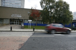
Within the session today we did an Exposure challenge where we participated in a practical photo shoot within the grounds off Hull College. The challenge consisted of individuals been split into groups to conduct a promotional shoot for Hull College. Within this photo shoot we had to consider the compositional techniques, in which we had discussed in the previous lesson. As we worked in groups we took it in turns to take some pictures as there weren’t enough cameras to go around.

One of the crucial elements in photography is exposure, as a group we learned the rules and the ways exposure works. From my understanding it is how much light is in an image. As already stated in my previous post, there are three camera settings that need to be balanced perfectly in order to create a professional photograph. The three things are, the aperture, ISO and shutter speed which makes up the exposure triangle.

Overall, I believe that the challenge could have been conducted better, this would be to do it on a better day when it isn’t raining. Also by planning more within the groups of what we were aiming to capture within the images and mainly having more time and camera skills to perfect the outcome of the photographs taken by myself and the group I was in. We have been asked to analyse some of the images taken, critically talking about what is good and what could have been improved if we were to do the challenge again. As we are just getting into learning the arts of photography, the images aren’t always going to be of the best quality. It’s a learning curve for me as it is something that I am interested in and want to improve at. Learning about the importance of exposure has given me more knowledge in which I will definitely use and will help me be a more successful practitioner of my own work.

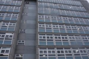
The first image I will depict is an image of hull college. It shows some of the compositional elements. It has pattern definitely in it. This is done by the windows within the image. In my opinion I also believe it has the rule of thirds within it as one third is interrupted by a part of the building that goes in. This also creates a leading line around the one third point. this draws the eye up the image creating the illusion that it is tall. If I was to take this picture again I would definitely change the settings of the camera to manual mode as it will allow me to adapt the settings more to how I find best fits with the image at the time. I also would go closer to the building and change the camera angle (high) as this will increase the illusion of the height of the building more. This will help to make the building appear more important and bolder. Also in the image that was taken there are parts of the image blurred as there was rain water on the lens. This would have been a better picture without the rain.

Photo source: taken by me

Photo source: taken by me

The second image i will look at is

Photography Reflection – Compositional Elements

After the introductions where out of the way, we then started the actual Photography sessions in which I could expand my knowledge and learn new things, that I already didn’t know about. Within the first session, as a group we discussed the different compositional elements associated and seen within photography. If instance things such as; The Rule of Thirds, leading lines, depth of field, framing, balancing elements, symmetry and pattern, golden triangle and backgrounds.

To illustrate what has been said, I have decided to log and reflect on the different sessions. This will allow me to comprehensively showcase my knowledge and understanding of the days’ session. I will also use elucidated examples of primary work and from secondary sources to help back up what I am talking about and to help give a visual aid.

Since, this was the groups first session in photography, there was no practical side to the session, we just went through the basic technical camera techniques used when taking an image. When entering any field, it is extremely important to have an understanding of the basics as this gives you a ‘foot in the door’. Even though, this was going back to revisit what I had already learned whilst studying on my previous course, it was a helpful and useful refresher and helped to jog my memory. I truly believe this will help me come a much better practitioner of my own work.

The first photography technique I am going to discuss is depth of field. Depth of field does exactly what it states, it adds depth to an image. Depth of field is measured from in front of the focal point in the image and going behind the focus point. To show my own understanding I attempted to take my own photograph using this technique.

Photo source: Taken by me

Photo source: Taken by me

The shutter speed was 1/50 of a second which allowed with the light conditions, a larger aperture of F.5 allowing the background to appear out of focus.

Above is my example of depth of field, which basically my nephew who is the main focal point in the image because he is the first thing which the viewer is drawn to because the background is blurred out. The boy is fairly sharp in the image in comparison to the background. He is considered, the more important subject in comparison to the background, in objective terms. I believe this image works really well as it shows the depth in the image and helps to isolate the boy making him the focal point and therefore the most important subject in the image.

There are different types of depth of field but basically it is what is in focus in an image. Shallow and Deep are the two different terms that are commonly associated when describing the qualities of the depth of field. The shallow depth of field means that only a small proportion of the photo will be in focus. A deep depth of field is when the majority or all of the image is in focus. This means that very little or no blurring occurs. Three factors play an essential part to a professional looking image. These are; the aperture size, shutter speed and good exposure gained by the aperture and shutter speed being correct.

The next element I will be talking about is symmetry and pattern, this is fairly simple really. Symmetry is where if an image was to be folded in half than it would replicate or be very similar to the other side. Symmetry is all around us in day to day life’s. From buildings with lots of windows, to fences or even brick work. I have taken a image to show my understanding visually. the image below shows an example of symmetry as if there was a mirror placed down the centre of the image it would reflect the same or similar image to what is already there. the only difference would be that the numbers wouldn’t show a reflection of itself. this works really well as the human eye is generally satisfied with things that follow a structure.

Photo source: Taken by me

Photo source: Taken by me

Another compositional element that is crucial is the framing. Framing is not just about placing the subject smack bang in the middle of the frame, it is about making it look aesthetically appealing so that the viewer will be stay focus on the image and not to make them visually annoyed or challenged. Framing is so important as it can change to full tone and mood of an image. If the framing is not right then it will not have the right affects on the audience, which can change the ways they take the information given out by the image. The image below shows a good example of how good framing makes an image work really well. For instance, the images has a sense of depth and layers. This could have easily have been manipulated in Photoshop, by merging to images together. Also the framing helps to leading the eye towards your main focal point which in this case I believe to be the tops of the trees and the sea.

My favourite compositional technique is leading lines. leading lines are line that direct the viewers eye into the image. it generally highlights a specific part in the image making it the focal point, the lines do not necessarily have to be straight. they can curve or bend. Lines can create depth to a photo as the lines can appear to get smaller the further away they get in the image. To show my understanding i have found an image online to demonstrate what i mean

In this image there is a leading line that draws the viewers attention into the image. This helps give the viewer visual direction (unconsciously) making them scan the picture from the bottom to top. The tone is set instantly by the image been in black and white. It gives a sense on eeriness and a dark side. In the top left corner of the image the sun light shines through making the image blurry at that side this means that if the image was in colour the preferred meaning behind it might be lost. Because the image is in black and white the viewers can see the full image without been drawn to a particular point. The way the image has been taken is as if the photographer was standing on the track. The image is taken at the viewpoint at low angle so is very close to the track lines the helps to emphasis the sense of how long the track is and makes the image seem like its going on forever. The track seems like its getting narrower and narrower as the track gets a further away distance, however individuals are aware that it stays the same width all the way down. Because of the tone been quite dark and eerie, this also helps that the photographer took the image in the middle of the track. This increase the levels of moral panic.The lighting in this photo would of been natural lighting as a photographer doesn’t use both artificial and natural in one shot. Lighting in this photograph helps to enhance the image and helps to soften the tone of the image making it seem really natural and not forced.There is no negative space so gives more focus and emphasis on the positive space in the image. Repetition is seen within this image as the tracks follows the mechanical structure allowing it to work.

The rule of thirds is another photographic technique that a lot of photographers use in there work. The idea behind the rule of thirds is that if you divide the image into 9 equal sections, then if you place the points of interesting along the lines or on the intersections the photo becomes more significant and balanced. This means that it gives the image structure and can also alongside with other techniques give the image depth. There is an image that i really like that uses the rule of thirds. this was one of Sebastião Salgato’s pieces which we looked at in class. it has the main subjects mainly in one third of the image.

The last compositional technique is the golden triangle, this is the one I’m least familiar with, however my understanding of it is that hyperthetically if you was to drawn on three diagonal triangles of all different sizes. that the main focal points would fall into one of the triangles. there should be 1 large triangle that comes in from one corner of the image through the centre of the image and the two smaller triangles. to show my understanding more this image shows visually what i mean.